 When using the WordPress Twenty Ten theme (for those not hosted on WordPress.com), it is desirable to remove the site header text that displays the site title and tagline at the top of the page. This conserves space and allow for a more artistic presentation of the site.
After removing the header title and tagline, the gap at the top of the page will be noticeable. To save page space, it’s a good idea to reduce this margin of white space at the top of the page above the header. To balance the narrower top margin, a smaller margin below the header image and navigation menu is needed.
Follow these instructions to adjust the margin of space above and below the page header image.
- From the Dashboard, under Appearance, click on editor.
- Click on the Stylesheet file link in the right column to begin editing the style.css file.
- Select all the text shown so you can copy it and paste it into the Notepad (Windows) or Text Edit (Apple). This way you can save a backup in case you want to go back.
- Scroll down until you see the text shown below. Change padding from 30px to 10px, then click the Update File button to save your changes.

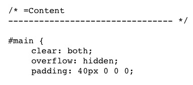
- Still editing the same stylesheet file, scroll down until you see the text shown below and change padding from 40px to 10px, then click the Update File button to save your changes.

- Preview your website and notice the changes.
- Make any further adjustments as needed based on your preference.