We’re all familiar with the tricks that some food manufacturers play in attempting to deceive consumers.
For example, with products that are high in calories, the nutrition label will list “calories per serving” with unrealistically small portion sizes being considered a serving. Only recently have we begun to see labels stating, “calories per bottle” or “calories per bag” as honest statements acknowledging that nobody is going to drink half of a small juice bottle.
However, some vendors play with the serving size and per bottle portions by listing the good ingredients “per bottle” and less desirable things like calories as “per serving” — making their product seem high in nutritional value but low in calories.
Other tricks include placing the “open here” tear package location over the nutrition information so that the top portion containing the calories is discarded upon opening. There’s also a tendency to have packaging seems be abnormally large and designed to fold over and hide nutrition information.
There is a new wave of fraud in nutrition labeling. The same food manufacturers that offer nutritious food with easy to read large print labels will put on their products of poor nutritional value labels that cant be read because the text is too small and/or the contrast is not sufficient.
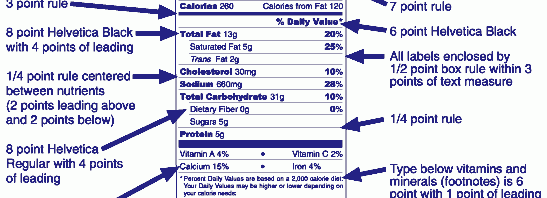
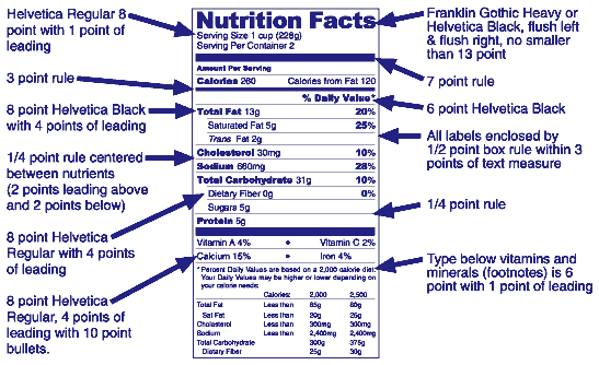
Making food nutrition information unreadable is in direct violation of the FDA Guidelines regarding food labeling. (PDF) The image at the top of this page is from the FDA website and is offered as a guide for proper product labeling.
At a time when everyone is paying extra attention to making content accessible to those with vision impairments, its inconceivable that nutrition labels would be this difficult to read. Below are some examples.
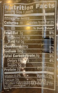
White Text on Clear Background. This first example shows a package with white text on a clear background. It can only be read (as illustrated below) when the package is emptied and then held against a dark background. It’s also necessary to cut the Nutrition Facts panel out of the package because otherwise the front of the package will obscure the details making it unreadable. It must also be held in just the right light to avoid glare. The image below is from a tiny pouch of condiments for oatmeal (from Starbucks). The oatmeal is sold as having 150 calories. However, when you add up the calories of all the packages of condiments, the oatmeal is high in calories. Starbucks proudly provides the nutrition information for their oatmeal on their website. However, if you’re looking for the nutrition information for the fruit topping, you’ll find this statement on the website: “The nutritional data for this product is not available online. You can find that information at your local store.” What you get in the store are hard to read labels. This is true for their Dried Fruit and Nut Medley toppings. The website offers no nutritional information. Keep in mind that the label below is substantially modified to make it readable.

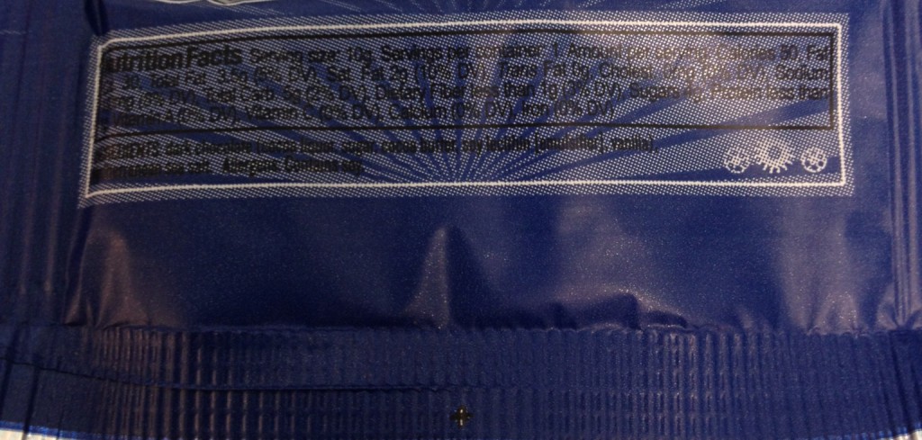
Font Too Small and Poor Contrast. The label below is a good example of an unreadable label. Even for those who might use a magnifying glass would have difficulty reading it. The printing is similar to bank checks and currency that are designed to be impossible to copy. Reading it is like trying to read a CAPTCHA phrase on a website. This example is from the GoPicnic Professor ZimZam’s Dark Chocolate with Sea Salt. The image here is substantially enlarged. You can click the image for an even larger view.
Nutritious Product with Large Print and High Contrast. Below is a nutritious product with a label that is clearly printed in large text with high contrast and is very readable. This item was packaged by GoPicnic with the chocolate above.


